Great branding empowers companies to move forward with intentionality, originality, and authenticity. It builds brand power, brand equity and gives control over how others perceive you. The following client highlights demonstrate what we mean by creating brands that put purpose, people, and meaningful design at the heart of what they do and morph from a commodity into a vehicle from which to accomplish more.
Sometimes our clients come to us with nothing more than an idea, and they need our help making that idea a reality. And if they have come to us, then they have probably "been there and done that," making them fully aware of the benefits branding has to offer. No matter where you are with your "formal" business plan, if you're committed to the task at hand, we'll help make your dream actuality.
Imagine trying to learn in a bamboo shelter with a tin roof, water pouring in, making it nearly impossible to focus or study. Or picture working tirelessly to build a small business–desperate to support your family–but with no tools or way to reach customers. This is the daily reality for many in Cabrera, Dominican Republic. Jessica and Rupert McCormac have taken action to offer opportunity to those in Cabrera who are determined to work for a better future.
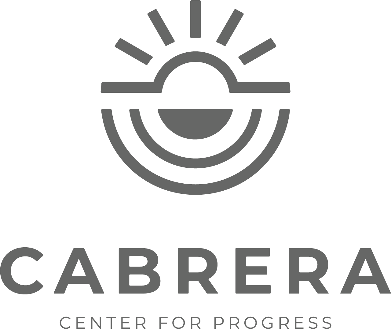
The Cabrera Center for Progress is a community center in Cabrera, Dominican Republic dedicated to enriching the lives of local residents by inspiring positive, lasting change. The Center will provide residents of the area opportunities for skill training, medical support, and various other initiatives to better the community and the wellbeing of its people. Through programs that strengthen individual capabilities and develop valuable skills, the Center hopes to spark a ripple effect of empowerment throughout the community.
Brand Goal: Exhibit value in the Cabrera community as a safe, inclusive, and welcoming space for locals to receive education and support, while becoming recognized throughout the Dominican Republic as an organization that educates and elevates the skills in the community. Also, establish legitimacy so that donors can rest assured their money is going to a worthy cause.
Verbal Brand
Visual Brand
Website
Foundational Marketing
Purpose: To facilitate lasting change in the lives of others.
Vision: To incite lasting change in the community of Cabrera by providing safe, inclusive, and accessible opportunities that strengthen the skills and capabilities of those who live there. By enriching the lives of these residents through programs designed to empower and enhance their skillset, we aim to ensure Cabrera can be sustained from within. It is our desire to inspire an environment of giving, learning, and connection by bridging local needs with global support.
The visuals had to be as strong and vibrant as the community they were created for. Through bright, crisp colors and imagery reflecting connections being established, we aimed to capture the vibrant Cabrera that is being supported. We also integrated representations of layering, building, and growing to show the gradual positive change that the Center will bring.
Brand Application Engagements:
With the guiding principles of welcoming every individual with open arms and hearts and coming together for the common good, we helped Cabrera Center for Progress:
The visuals had to be as strong and vibrant as the community they were created for. Through bright, crisp colors and imagery reflecting connections being established, we aimed to capture the vibrant Cabrera that is being supported. We also integrated representations of layering, building, and growing to show the gradual positive change that the Center will bring.
Brand Application Engagements:
Logo & Visual Identity Creation
Website Design
Presentation Materials
As an organization established by a desire to give back, we are committed to fostering an environment that is supportive to all involved. We believe in the ability to improve the lives of all that we encounter through intentional efforts and meaningful support. We will work to ensure that everyone in our organization—from service partners to project coordinators to volunteers—will all obtain a sense of belonging, purpose, and appreciation from the work they are a part of.
Armed with a strong brand that included a freshly created pitch deck and website, the McCormacs ventured to Cabrera to continue their work. With their new brand and the confidence it provided, they have been able to secure more donations and are now at the finish line with the construction of the Center.
The Spinx Company is no stranger to the convenience business. While “Making Life Easier” has always centered around the ability to fill up your tank, Spinx is ready to introduce an elevated convenience to the heart of Greenville’s downtown, all without their mainstay of fuel. So how do you differentiate this market concept from their current gas and convenience stores? That’s where we came in.
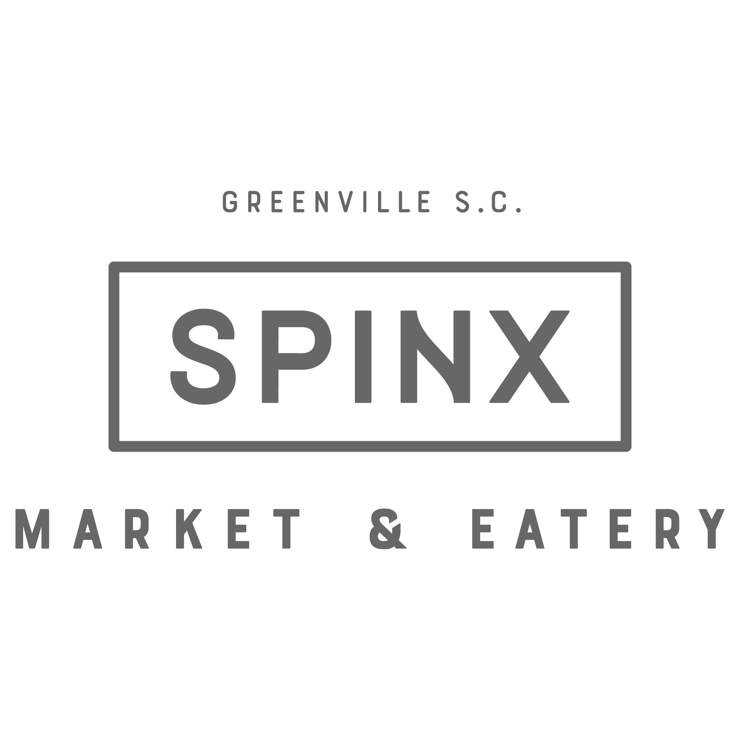
Regardless of whether you're a visitor, local, bar hopper, or on-the-go professional, the new Spinx Market & Eatery promises patrons a delightful—even memorable—convenience experience. This modern soda shop of sorts is strategically located in Greenville's West End and takes pride in its approachability, enjoyable atmosphere, and commitment to elevating the downtown experience. Extended hours, thoughtful offerings, and a brief respite before you're on your way are just a few ways the Spinx M & E will make your time downtown even better.
Brand Goal: Establish the Spinx Market & Eatery as the "go-to" spot for an elevated downtown convenience experience.
Verbal Brand
Visual Brand
Exterior Concepts
Environmental Graphics
Interior Concepts
Purpose: To make life happier.
Vision: To craft a community-centric market and eatery designed to make your day downtown better, not just easier. The Spinx Market & Eatery’s knack for having what you want, paired with its inviting atmosphere and unique selections, will bring you and your friends back time and again. The M & E will become a Greenville "must-do," a delightful surprise, and a West End landmark. The brand will be synonymous with its commitment to quality and hospitality, the products a welcomed addition to any social setting, and the experience one you won't forget. Spinx’s roots are in making life easier, but as they elevate their craft and share their gifts, providing happiness will become its legacy.
The Spinx parent brand is designed to help people on-the-go, while the Spinx Market & Eatery is meant to help you slow down, be present, and enjoy the moment. The brand's logo is nostalgic yet timeless, elevated but approachable, fun yet classy, designed to stand the test of time and appeal to people of all ages, stages, and walks of life.
The Spinx M&E brand is characterized by a deep red color, which evokes a sense of nostalgia reminiscent of striped popcorn boxes, picnic blankets, and retro diners. The brand's friendly, adventurous personality is emphasized through a collection of colors, illustrations, and graphics that create a unique and exciting downtown experience.
Brand Application Engagements:
Whether pouring your beer or making your lunch, the Spinx Market & Eatery promises to do so with a friendly, easygoing attitude. You are enjoying your day, and your visit to the M & E will only improve it. The store will be clean, the bathrooms fresh, and the displays organized and inviting. You will never feel rushed or unimportant and, hopefully, leave feeling as though you've always known them.
We helped Spinx craft the foundation for their new concept (which will hopefully expand to other downtown cities) by:
A picnic, a soda shop, and a beer garden all have something in common - they provide a place and space where you can pause and enjoy the simple things. They allow you to slow down, be present, and savor the moment. The Spinx Market & Eatery in downtown Greenville is just such a place. They welcome you to come and stay a while, whether that means just a few minutes or a little longer. You set the pace and they are happy to make your day a little brighter. From friendly and attentive staff to delicious culinary creations and thoughtful on-the-go items, the Spinx M & E is delighted to have you as their guest and looks forward to seeing you again soon.
The Spinx Market & Eatery is currently under construction at the old Cook's Station site located at the intersection of River and Augusta Street in West End Greenville. The historic building will be modified to pay homage to its original use as a filling station.
The market will cater to pedestrian traffic and provide delivery options, serving elevated quick-service food offerings that will be prepared on-site, fresh local goods, gifts, and on-premise alcohol. The renovated property will feature a covered patio for pedestrian and delivery access, a grassed open space, and a children's play area.
The new Spinx Market & Eatery is expected to open later this year. Keep an eye out for it!
When Bern and Mary DuPree and several friends realized their children had classmates in unstable living situations, they felt compelled to help. With the creation of a non-profit real estate holding company, Alice House, they could assist families with children in grades K-12 to escape housing insecurity. Providing shelter and stability to children with housing insecurities is the heart of Alice House. From their new sustainable living conditions come enhanced educational and economic outcomes, leading to more opportunities for success. Alice House equips families with the support and resources to build a better future, creating lasting change and building a stronger, more resilient community for generations.
Brand Goal: Develop a visual identity that captures the stability and hope Alice House provides, while establishing a strong foundation and recognizable brand from which they can grow and thrive.
Verbal Brand
Visual Brand
Foundational Marketing
Promotional Design
Website
Every element of the Bobby Marteau identity was intentionally developed to tap into the subconscious self—the free-spirited, adventure-seeking, rebelliously authentic alter ego within all of us—by creating a brand that inspires the journey as much as the products themselves. The Bobby Marteau brand was crafted to meet a set of ambitious objectives: to stand confidently among high-end luxury brands; to remain gender-neutral; to express authenticity, sophistication, and a touch of edge; and to possess enough presence to stand alone without overshadowing the product. Bold yet refined, iconic yet mysterious, the brand encapsulates the timelessness, quality, and functionality of the bags while mirroring the expressive individuality of the people who carry them.
Brand Goal: Create a dynamic, enduring brand that captures the excitement of travel while celebrating individuality, adventure, and the courage to define one’s own path—strategically designed to evolve and expand alongside the company as it grows.
Verbal Brand
Visual Brand
Foundational Marketing
Promotional Design
Experiential Marketing
Strategic Planning
Product Design Consulting
Inspired by the quiet power of daybreak, the FirstLight brand is rooted in the moment when darkness gives way to direction. It reflects a philosophy that is both steady and ambitious: that meaningful impact is created by seizing opportunity early and investing with intention. Just as the first rays of light appear on the horizon before the day fully reveals itself, FirstLight operates with foresight—seeing what’s possible before it’s obvious. We captured their rare ability to recognize opportunity—and act on it with clarity and confidence. That sense of optimism is infectious, and it became the driving force behind their name, as well as their visual and verbal identity, built around momentum, purpose, and possibility.
Brand Goal: Develop a name and visual identity that clearly express how the company uniquely does business, capturing its distinctive approach to investing while establishing a flexible, enduring brand built to grow alongside the company.
Verbal Brand
Naming
Visual Brand
Foundational Marketing
Promotional Design
If you've suddenly found yourself swamped with customers or are planning to expand, that means you're doing something right. But before you pat yourself on the back, let's make sure you have everything in order. Now is the perfect time to solidify your identity and streamline the way you portray your company so that as you continue to grow, you stay true to who you are.
When nationally recognized institutions for new play development shut down during COVID, a void was left in the creation of original works. Seeing Greenville’s potential, the South Carolina New Play Festival was founded to fill that gap and establish the city as a beacon of innovative theater.

South Carolina New Play Festival (SCNPF) is a nonprofit organization dedicated to developing and showcasing new and original works of theater including plays, musicals, and variety acts. Each year, SCNPF hosts a multi-day festival in Greenville, South Carolina, featuring script reading performances and a Broadway cabaret. By providing playwrights with a platform to develop their work and receive live audience feedback, SCNPF fosters connections between local talent and nationally recognized theater professionals. Performances take place at various venues throughout the city both inside theaters and outdoors in parks and on streets, turning Greenville into a hub for creative storytelling and theatrical innovation. Beyond the annual festival, SCNPF supports year-round development opportunities for artists and playwrights through workshops and masterclasses for professional development and student enlightenment.
Brand Goal: Establish recognition as a premier platform for new works in theater, while embracing and uplifting local talent and offering a variety of high-quality productions that everyone can appreciate. Ultimately, being recognized as a fun and exciting event in Greenville that people throughout the Southeast come to enjoy.
Verbal Brand
Visual Brand
Promotional Design
Experiential Marketing
Purpose: To be a beacon of innovation in the performing arts.
Vision: To be a transformative force in the performing arts industry, setting the standard for the future of American theater and play festivals with bold, innovative works that invoke imagination and unite audiences of all backgrounds. We aim to establish the Greenville community as a renowned industry destination where new voices are celebrated, creativity knows no bounds, and groundbreaking works connect others and elevate the human experience.
Typography takes center stage in the South Carolina New Play Festival brand, embodying movement, action, and personality. The type itself is dynamic, brimming with energy and creativity, making it the art rather than a mere vessel for the message. Its clever design reflects the brand’s innovative spirit, celebrating the bold and transformative nature of new theatrical works. This approach captures the essence of motion and vibrancy, where every letter, like every act, carries its own character and impact.
Brand Application Engagements:
Armed with the values of entertaining with meaning, creating space for all, and believing in the possibilities, we helped SCNPF:
Our organization is rooted in creativity, inclusivity, and respect. We are committed to fostering a space where a multitude of voices are not just welcomed but also celebrated. We believe that great art thrives in an environment of fairness, and we uphold this by providing equitable compensation, meaningful experiences, and thoughtful support to every artist, partner, and team member we work with. We strive to create an atmosphere where taking risks is encouraged, new ideas are nurtured, and every participant—from playwrights to donors to audience members—feel seen, valued, and empowered.
The impact of this year’s festival was significantly amplified with a 20% attendance increase from the previous year. Out of the total 3,500 attendees, an estimated 1,934 were tourists. The programming was made up of 8 staged readings of new plays and musicals, a Live Arts Fair, and an outdoor variety stage—all of which brought together Broadway, television stars, and local talent, reinforcing SCNPF’s commitment to building a bridge between Greenville and Broadway.
Backed by a clearly defined verbal brand that identifies its challenges and goals, along with a powerful, aligned visual identity to share its story, the festival now has a strong foundation to drive continued growth and success.
Is it possible to ever fully reach your potential? Of course, but it takes a conscious effort. Whether you are talking about a person or a building, success requires self-awareness and action to move the needle, and in the case of THS, they don’t want to move the needle; they want to break the gauge. THS is committed to doing what it takes to get the job done right, on time, and with maximum potential top of mind.

As a 100% employee-owned firm, THS Constructors has built more than just buildings—they have built a solid reputation in the industry and countless relationships across the Southeast. Since its founding by Howard Suitt in 2005, THS has grown steadily across the Southeast, building a premier reputation that continues to meet the ever-evolving needs of clients across diverse industries. After 20 years, it was time for an updated brand reflecting a commitment to innovation and continued growth. This brand refresh kept the brand recognition that their company has gained throughout the years while modernizing it for a bold, confident look.
Brand Goal: Display confidence in this new chapter of the company, while adding more approachability to the brand, maintaining the established brand recognition, and furthering the positive reputation THS has built within the industry. The result: Brand elements that are strong enough to stand alone or work together to convey the company’s commitment to quality and expertise with the ability to be successfully applied across a wide variety of applications.
Verbal Brand
Visual Brand Refresh
Website
Foundational Marketing
Promotional Design
Experiential Marketing
Photography/Art Direction
Proposal Templates
Press Releases
Purpose: To enhance the world’s ability to create.
Vision: To set a new standard for the construction industry by establishing relationships as the cornerstone of our process, both internally and externally. The fundamentals we hold at our core today will propel THS forward and set us apart. Ultimately, the THS name will be synonymous with quality, innovation, safety, expertise, and opportunity on an industry-wide scale. Anyone can deliver a building. THS will deliver potential—improving our clients’ ability to create their products and offer them to the world.
Leaning into the memorable yellow that stands out among competition, the refreshed brand palette is more visually pleasing and versatile while maintaining brand distinction. The visual brand reflects ambition, attention to detail, energy, and confidence—all qualities of THS.
Brand Application Engagements:
THS aims to raise the bar, always do the right thing, and invest in relationships. With these guiding values, we helped THS:
At THS, we work as a team and we win or lose together. Every one of us, quite literally, has skin in the game. It’s this level of commitment that builds trust. And when trust is paired with innovation, there’s no limit to what we can achieve together. Everyone has a voice—and that voice is always heard and valued. The buildings we create are the by-product of the trusted relationships we build FIRST. But we aim to deliver more than a building. We aim to deliver potential—to our clients, the products they create, and to our stakeholders.
THS has already experienced measurable results from its refreshed brand, including securing a major expansion project. Their updated identity positions the company for the next 20 years, presenting a more modern and approachable image that strengthens its presence in existing markets while opening doors to new opportunities.

When Clay and Tracy Mardre took over Clay’s family business, they knew that I&M Industrials’ dated look needed a brand refresh. However, they wanted to ensure I&M’s established reputation was still recognizable. I&M Industrials is a full-service industrial distributor throughout South Carolina with over 57 years of expertise. It is known for providing responsive, fair-priced, and high-quality service in the compressed air market. Their size as a family-owned business allows them to offer personalized attention and quick decision-making, catering to customer needs without corporate red tape. They wanted to build on the unparalleled service that had defined their family business for over half a century—blending innovation and growth while maintaining the quality they’re known for.
Brand Goal: Create an updated brand that nods to their previous branding with a fresh new look that is both eye-catching and easily identifiable.
Verbal Brand
Visual Brand
Foundational Marketing
Promotional Design
Experiential Branding
Website Reskin
When ACS came to us, they were already a fast-growing, innovative, and successful company that offered the largest selection of superior-quality air compressor parts both on-location and online. They grew so rapidly that ACS originally came to us wanting us to create a customer journey map to help them more clearly understand their customers’ experience and make it the best it could possibly be. Our work together went so well, it morphed into developing an elevated visual brand (including a simplified logo with more flexibility) and office environmental graphics that could be implemented in both their current and new office locations – they already had a strong internal culture in their established office location and wanted that unified pride to extend into their second location as well.
Brand Goal:
Refine and perfect a consistent and on-brand experience for both ACS customers and employees through key messaging, a refreshing narrative, and a more-intentionally developed visual internal culture experience in both of their office locations.
Verbal Brand
Partial Visual Rebrand
Customer Journey
Touchpoint Mapping
Foundational Marketing
Experiential Branding
eCommerce Messaging
Packaging Design
Strategic Planning
As a company, Dovetail might be a relatively new player in the Upstate’s construction industry, but founders Chase Lanier and Eric Segale bring a wealth of experience and knowledge from one of the larger players in the business to the table. Together, they’ve built a full-service General Contracting firm with a focus on light commercial and industrial builds. Their complementary strengths and experience provide a well-rounded perspective and enable them to approach each project with intentionality and determination. Ready to take things to the next level, they wanted to fine-tune their brand to reflect the precision and attention to detail in each and every job they take on.
Brand Goal: Refine the current visuals to convey the same level of craftsmanship Dovetail brings to its builds and convey who they are and what they do with clarity through a streamlined brand narrative.
Verbal Brand
Visual Brand Refresh
Website Refresh
Foundational Marketing
Proposal Templates
Change is inevitable, and change may be the difference between success and failure when it comes to your business. When ownership, leadership, structural, or generational shifts occur, a change in your brand may need to follow. We can help you navigate this change and arrive on the other side better than ever.
A single insulation fiber cannot reach its full potential on its own; however, when these fibers are woven together, they can achieve significant outcomes beyond what each one could accomplish individually. Many hands make light work, and Insulate America provides the solidarity and support for collective action.
Overview
Insulate America (IA) is a cooperative in the insulation industry that was created to provide independent insulation contractors across the US with shared buying power, business support services, and a community of peers. With their continued pursuit of providing only the best for their members, IA sought to modernize their brand and refine messaging to reinforce their true values and the level of service they provide. Established in 2000, this organization has had over 25 years of experience in the industry building their reputation and establishing their network of partners, and it was time to take the brand everyone had come to know and strategically improve it to reinforce their continued growth.
Brand Goal: To introduce a new chapter to connect existing members and corporate partners while positioning the company for growth—making strategic adjustments to provide application versatility, reinforce reputation, and remain relevant among the competition while attracting new members.
Verbal Brand
Visual Rebrand
Foundational Marketing
Promotional Design
Experiential Planning & Design
Website
Video Production
Purpose: To leave a lasting impact through a community with the power to make positive change.
Vision: To positively impact the world of insulation on a daily basis by continuing to build our intricate network of connections, integrity, and a resource-rich community. Through strategic partnerships, shared resources, and meaningful relationships, we create lasting value and positive outcomes for all involved.
The color palette showcases a rich patriotic palette channeling warmth and sophistication, while the updated brand mark represents the collective force of the Insulate America community through the combined symbols of the architectural insulation symbol and the American flag. Together, these pieces command attention and represent the strength of their community.
Brand Application Engagements:
We supported Insulate America’s goal of improving the connection between their members and their brand by:
Insulation is gritty work. We get that. That’s why our organization remains grounded by putting the success of others first, regardless of size, status, or experience. Authentic relationships are our foundation, comprised of open communication, trust, and mutual respect. Do you know how to tell when something is authentic? For our members, suppliers, and industry network, it’s our ability to remain consistent in experience and expectation across all interactions. We are humble yet strong. Knowledgeable and dedicated. We work incredibly hard but also have a sense of humor. We have an appreciation for the finer things because we know they are not what really matters. What it boils down to is that we have a gift. Something unique and powerful. But the power is not in one person, it lives within the IA community. One from which businesses grow, inner value is celebrated, and lives change—if not the world.
Insulate America’s new clearly defined brand and its applications has provided the organization with the resources they need to rally individuals behind their message. They are now clearly differentiated from any competition and are positioned to attract quality new members.
With the purchase of Galloway-Bell Insulation's industrial division from an outside entity, Partner Cally Galloway had the opportunity to finally become the sole owner of a new (but not so new) insulation company.
Galloway Insulation (formerly the residential and commercial division of Galloway-Bell, Inc.) has proudly served the Upstate with quality insulation services since 1972. While the "new" company required a new name and identity, Cally Galloway set out to honor his late father's legacy and previous partner while making it his own. Over the decades, the three previous partners were known for their experience, expertise, and strong reputation for an unwavering commitment to quality, honesty, and reliability. And this would remain. But now it was time to infuse Cally's personal values into Galloway Insulation's new visual identity that would take his company through the next 50 years.
Brand Goal: To smoothly transition from Galloway Bell, Inc. to Galloway Insulation with a new, refreshed look while also capturing the qualities that made the former Galloway Bell, Inc. one of the most resilient insulation companies around.
Verbal Brand
Visual Brand
Promotional Design
Experiential Marketing
Environmental Graphics
Website
Purpose: To strengthen others by connecting good people.
Vision: To do more than just install insulation—we build stronger people. While insulation itself is hidden within the walls of a building, its impact is profound: creating more efficient, cost-effective spaces that benefit our customers. Similarly, the work we do to support and develop our employees may not be immediately visible, but it has a lasting effect. By fostering growth, confidence, and a sense of worth among our team, we help individuals reach their full potential. When people thrive, good things happen.
The color palette showcases warmth with welcoming nature tones that radiate approachability and loyalty. When paired with the bold icons and graphics that symbolize connection and pieces coming together, this new look communicates the goal of Galloway Insulation—connecting good people and doing great work.
Brand Application Engagements:
Equipped with strong values that were instilled by their founder, Cally Galloway’s father, we helped Galloway Insulation:
Galloway Insulation’s goal is pretty simple—to connect good people. Through our long-standing commitment to honesty and reliability and our strong reputation, we have been able to build a company grounded in repeat business and loyalty from the other skilled professionals we work with. We pride ourselves on being a conduit for good people and good work, and this empowers us to strengthen others and foster growth, confidence, and sense of worth for all involved. By cultivating open, transparent relationships and holding each other accountable, we’ve created a business culture that thrives on genuine connections, mutual respect, and a dynamic web of connections that benefits everyone involved.
With a clearly defined verbal identity and refreshed visual graphics, the company now has a strong foundation to build upon moving forward. Cally Galloway has successfully honored the legacy of his father and their former partner while shaping a refined brand for the future—one that is both distinctive and enduring, and that the company can proudly stand behind.
ECCAC believes in walking the journey of healing with the children and families it serves. They provide a safe, child-friendly environment for these kids to feel seen, heard, and supported. As a member of the National Children’s Alliance, ECCAC brings representatives from more than 11 government agencies under one roof to advocate for children throughout the entire process of their journey. Beyond advocacy and evidence-based therapies, ECCAC strives daily to educate and prevent such terrible events from occurring in the first place. They are an organization aimed at restoring hope and transforming lives for the better—believing that the hearts they heal today will become the hearts of tomorrow’s leaders.
Brand Goal: Elevate the brand narrative and visual identity to represent the caliber of service the organization brings to the community in a positive way—ensuring that the seriousness of the topic at hand is not lost but the greater message of hope and positive impact shines bright.
Verbal Brand
Visual Brand
Brand Launch
Brand Illustrations
Foundational Marketing
Website
Photography
Values Alignment
Strategic Planning
Brand Training
Overview
When opposites attract, they not only build a strong relationship, they also provide the perfect building blocks for a killer dental group. Adam and Neely Carraway took over an established dental practice with a loyal patient base and tons of local street cred. However, their innovative dental approach and exceptional patient care were getting lost in translation. Adam focuses on preventative and restorative care, providing patients with positive dental experiences by preventing tooth decay and gum disease before it becomes an issue. Neely brings her warm and energetic personality into the mix, making each and every patient feel like family. The combination of these qualities resulted in a sophisticated brand that is equal parts innovative and welcoming – a match made in dentistry Heaven.
Brand Goal: Spread Cove’s message of preventative and restorative dentistry far and wide by focusing the branding around protection, warmth, innovation, and the confidence a person has when their teeth look and feel amazing.
Verbal Brand
Naming
Visual Brand
Foundational Marketing

Indigo is a pediatric dental practice who takes individualized care and the pursuit of happiness to a whole new level. In the beginning, however, their biggest hurdle was creating and communicating the newly acquired practice was now, in fact, a completely new company and brand.
Brand Goal: Create a meaningful, purpose-driven brand that is distinct from the competition and previous ownership, that embodies the practice’s values, and which creates a memorable, fun experience for all.
Verbal Brand
Visual Brand
Brand Launch
Foundational Marketing
Promotional Design
Experiential Branding
Touchpoint Study
Touchpoint Marketing
Packaging Design
Brand Workshop
Strategic Planning
Brand Workshop
Branding an event can be just as crucial as branding your entire company. A well-executed event brand serves as an extension of your company's identity, providing your target audience with a unique opportunity to connect with your brand through an immersive experience. At Todem, while we may not specialize in event planning, we excel in helping you enhance your event by crafting and implementing a strategic branding plan.
When Switch approached us to brand their annual Freedom Gala and help make it their largest event yet, we were thrilled to support such a meaningful cause—especially with Tim Tebow as the keynote speaker! Switch is a grassroots nonprofit leading the fight to end local sex trafficking in Upstate South Carolina, with a mission to empower people with practical opportunities to be God's light in the darkness. Inspired by this mission, we developed the visual theme "Be a Prism of Light." Just as a prism combines different colors into a single, brilliant white light, Switch’s collaborative efforts within our community form a radiant force that dispels darkness, illuminates the lives of victims, and strives to end sex trafficking and exploitation. To bring this theme to life, we created a unique save-the-date, a holographic foil invitation that reflects light, a dedicated webpage, and event-day materials and programs.
Theme Concept
Moodboard
Decor Inspiration
Save the Date Direct Mail Design
Invitation Suite Design
Webpage Design
Sponsorship Materials
Event Signage and Programs

After rebranding the Emerald Coast Children’s Advocacy Center (ECCAC), they asked us to elevate the branding for their annual Gala and Golf fundraiser. Drawing inspiration from the whimsical paper cut-out artwork central to their primary brand, we maintained this distinctive style while enhancing the colors and designs to create an enchanting experience for adults. We highlighted the event's high-end quality with touches of metallic gold throughout. Through our invitation and program designs, along with overall event guidance, ECCAC successfully developed a sub-brand that aligned with their main brand while adding a unique flair to complement the weekend's elegance.
Event Logo
Theme Concept
Moodboard
Custom Illustrations
Decor Inspiration
Save the Date Design
Invitation Suite Design
Webpage Design
Ad Design
Social Media Templates
Sponsorship Materials
Event Signage and Programs
Auction Presentation
We’re passionate about giving back to our community, so when the South Carolina New Play Festival (SCNFP) asked for help with their poster design, we were thrilled to support our fellow creatives in bringing this inspiring event to life! The unforgettable showcase infused our city with creativity from the New York theater scene and beyond, featuring musicals, plays, town halls, outdoor variety stages, and a Cabaret. The event graphics captured the vibrant energy it would bring to Greenville, drawing inspiration from our city and the shows highlighted throughout the weekend.
Event Logo
Theme Concept
Moodboard
Custom Illustrations
Print Ads
Digital Ad
Posters & Rack Cards
Outdoor Displays
Lightpole Banners
Feather Flags
Promotional Design
Social Media Templates
Event Signage and Badges
We’ve had the pleasure of designing the invitations and programs for the elegant Hope Ball for years, always weaving the event’s theme into the print graphics to support its worthy cause. With the recent transformation of the Cancer Society of Greenville County into the vibrant Neighborhood Cancer Connection, this year’s ball offered a chance to introduce a fresh twist. We infused the event with new energy, reflecting the brand's refreshing changes through a bright and lively design. The invitations featured vivid colors, crisp illustrations, and a Mediterranean-inspired theme, adding a burst of vitality to the occasion.
Event Logo
Moodboard
Custom Illustrations
Materials for Promotional Events
Save the Date Design
Invitation Suite Design
Social Media Templates
Event Menu and Table Number Design
Event Programs
Branded Napkins
Event Signage
Mavin approached us needing to align their numerous graphic elements to create a consistent brand identity. They were pleasantly surprised by how the verbal brand provided clarity and definition to their visual identity and overall company culture. Excited by these updates, they wanted their employees to share in the transformation. We facilitated an internal brand launch, leading a day of team-building where the new visuals were unveiled, followed by a Values Alignment Workshop. As a construction and maintenance company, Mavin’s employees are often the primary touchpoint for clients, making it crucial that they embody the brand experience. Through the workshop, employees were able to connect Mavin’s company values with their own personal values, adding deeper meaning to their daily work. This alignment not only enriched their individual experiences but also empowered employees to actively bring the brand to life every day, reinforcing Mavin’s values in every client interaction.

After we developed the name, verbal and visual brand, and supporting graphics for Indigo Pediatric Dentistry, Dr. Rula wanted her staff to fully grasp the meaning behind the branding for her new practice. She saw the value in our Values Alignment Workshop, which helps employees explore their personal values and connect them to the company’s values, adding deeper significance to their everyday work. Dr. Rula, deeply committed to both her patients and her team, wanted to establish and nurture the company culture from the outset. During the internal brand launch, her staff had the chance to bond, understand Indigo’s culture, and align their personal values with those of the practice—ultimately resulting in happier employees and a more consistent, authentic brand.
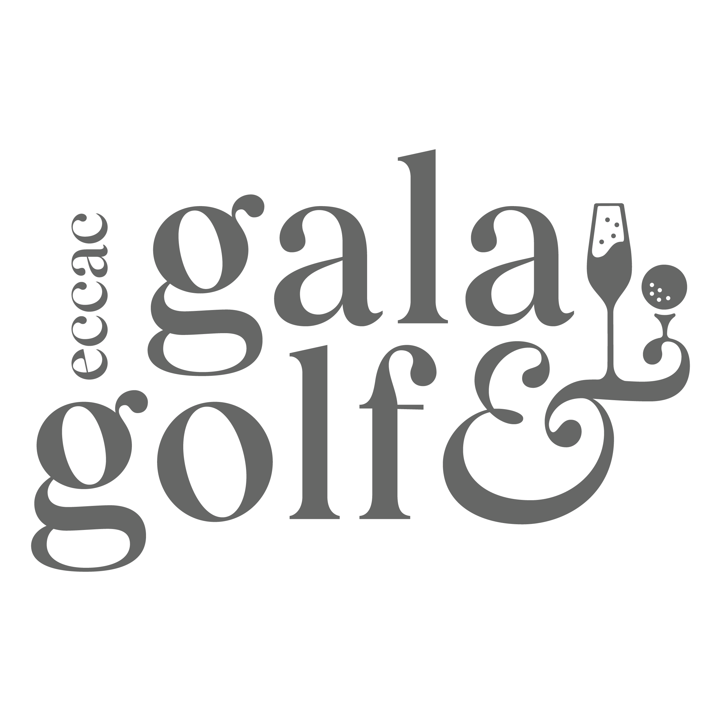
We were honored to partner again with the Emerald Coast Children’s Advocacy Center (ECCAC) to create the brand identity for their Gala & Golf Weekend. Centered on the concept “We are the light,” the design illustrates how supporters unite to create something beautiful and illuminating. We envisioned the Gala & Golf Weekend as a prism—gathering the collective light of everyone’s efforts and reflecting it into vibrant colors and luminous blends. Just as the broken pieces of a childhood can be slowly and purposefully reassembled, this event brings hope and wholeness. The resulting identity is both celebratory and meaningful, honoring ECCAC’s life-changing work and reinforcing the idea that, together, they illuminate the path forward for the children they serve.
Event Logo
Theme Concept
Moodboard
Custom Illustrations
Décor Inspiration
Save the Date Design
Invitation Design
Webpage Design
Ad Design
Social Media Templates
Sponsorship Materials
Event Signage and Programs
Auction Presentation

The 2025 festival marked the debut of the South Carolina New Play Festival’s bold new brand—an identity designed to be as dynamic and original as the work it celebrates. Through vibrant blocks of color, distinctive patterns, and a striking duotone photography style, the visual system spotlights the individuality, personality, and creative voices of the artists at the heart of the festival. SCNPF sought a brand that would both elevate local talent and signal the exceptional caliber of its productions, positioning the festival as a vibrant, must-attend cultural destination for audiences across the Southeast. The event brand captures the energy, motion, and daring spirit of live performance. Together, these elements reinforce SCNPF’s role as a catalyst for fresh ideas and bold storytelling, setting the stage for what’s next in contemporary theater.
Event Key Art
Theme Concept
Moodboard
Print Ads
Digital Ad
Posters & Rack Cards
Outdoor Displays
Lightpole Banners
Feather Flags
Promotional Design
Social Media Templates
Event Signage and Badges


Think we're a fit? Want to hear more? We'd love to meet you in person, and if that's not possible, a phone call or email works too.
hello@todembrands.com
864.448.0600
141 Traction Street
Greenville, SC 29611
Sign up for our newsletter.
Check us out. We're not shy.